Showing posts with label art. Show all posts

Monday, September 30, 2013

Postcard from Cardiff


Unexpected highlight of my trip to Cardiff: the wall which protects Bute Park from the traffic-clogged Cowbridge Road. Perched on the coping stones are delightful animal sculptures some with glass eyes making them seem so alive I imagined them poised on the point of escape into the city centre. I may start a campaign for all walls everywhere to be fitted with these.

The actual purpose of the trip also mixed the imaginary and real worlds - I went to see a painting which featured in Margaret Forster's book 'Keeping the World Away'. The book is part fictionalised biography of the artist Gwen John and part story of other women who've encountered one of her paintings. It's the one on the right below and is called 'Corner of the Artist's Room'. You can see she used the corner as backdrop for other paintings, there are even several versions of the 'Corner' itself and a print of it hangs in my own house. Cardiff Museum and Art Gallery are lucky enough to own an original, well worth driving 100 miles to see. I love the picture because the dormer window is similar to that in my 'book nook', although my view is of south Birmingham tree tops rather than Parisian roofs.


Another unexpected delight in the Cardiff area is Dyffryn Gardens. You know how much I enjoy sitting in a garden and how much I dislike actual gardening. Popping into each differently themed garden 'room' at Dyffryn was fascinating and attempting to select a favourite impossible. What's that? You're not interested in the plants, you want to know about the cafe? Come on, it's National Trust, of course they do good cake!

Wednesday, November 28, 2012

Postcard from the city

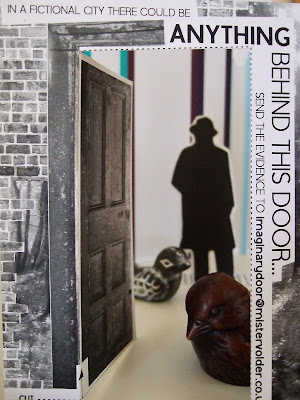
'Mister Volder goes to the City' is a surreal short story by Ben Pacey. A man arrives in a new place and tries to build a life there assisted by a talking dog with a cough which might improve if it smoked fewer cigarettes. The story is also the inspiration behind an exhibition currently on at the mac in Birmingham. There's a short film which gave me the disoriented feeling of arriving in a new place, copies of the story to read, a model city and, best of all, postcards!

These postcards invite their readers to create their own Mr Volder story. That's my 'The Birds'-inspired one posted above. You can see more at their postcard blog and there's a running display as part of the exhibition.

The combination of postcards and stories was almost guaranteed to appeal to me. Why not try it? Head down to the mac, buy a coffee and take a seat. It'll be a nice day out in the city. Unless any small dogs speak to you...

Monday, April 2, 2012

Postcard from the United Nations

This scale-replica of a UN office in Geneva came to Birmingham as part of Fierce Festival. It was a delight to see the chosen dachshunds taking their seats as representatives of various countries and likely that they managed to achieve as much in their 'meeting' as any UN council does. They certainly behaved well. Only a few tried to escape and their media coverage was overwhelmingly positive. Perhaps the world really should go to the dogs.

Can't say I was impressed by the entrepreneurial fast food vendor who'd set up stall to sell hot dogs next to the gathering though...

Sunday, October 16, 2011

Postcard from The Big Draw

The Big Draw is a campaign whose aim is to get everyone drawing. They claim "Drawing helps us to think, invent and communicate – regardless of age and ability." Filling a wall with Etch-a-Sketches is guaranteed to tempt passers by at the MAC to have a go. Critical design fault though: you can't shake the frames to erase previous 'scribbles'. Which means that only the highest placed had room for new 'drawing' and those of us who are not so tall couldn't reach them.

What would you guess to be the most common 'sketch' made? Yup, names. Why pass up an opportunity to tag your graffiti?

Friday, June 11, 2010

Postcard from the Design Museum

In every day life good design goes unnoticed.  Only when an item's not quite right is it detected, cursed and improvements desired.  The Designs of the Year exhibition at the Design Museum in London has selected a collection of items and concepts which make significant or radical improvements to life, or will once they are translated into products.

You'll be wondering how a tank full of plastic pandas fits into this.  They're old style WWF collection boxes - the type which used to gather dust on shop counters.  Largely ignored.  Well, this installation of them can't be passed by.  The pandas are mounted on sensors which know where you are.  They detect the presence of an observer and swivel to look you in the eye.  The photo shows them in the process of turning to look at someone approaching from my left.  The iconic logo of the WWF interacts with you and demands your attention.  Forget charity collections by students with clipboards on the street, the pandas' stare cannot be ignored.  Charity donations - as improved by design.

The range of items on display was surprising.  From commodes to concept cars, there is no aspect of life which escapes the designers' attention.  The winning design was for a folding plug - as slimline and lightweight as the laptop it's carried with.  That wasn't my favourite though.  I liked the political commentary such as the Cafe of Equivalent Cost, where a bowl of soup which would cost a farm worker in Mozambique twenty cents was sold to London bankers for £111.  Trouble is that while that cost shocked me, the city boys probably lapped it up; literally.  What I really loved though was Sugru.  It's a fabulous new material which you use to adjust, amend, fix and generally make the products you have better suit you.  It's cheap, it works on everything and it could change your life.  If you're the sort of person who's always swearing at your tin opener, that is.

Saturday, May 1, 2010

Postcard from mac

mac (the Midlands Arts Centre) has reopened after being closed for refurbishment for far too long.  It's been worth waiting for.  Smarter, brighter, and bang up to date - the building feels revitalised.  It's largely the same layout (a labyrinth), but the atmosphere of grim has been dispelled.

The opening day crowds were testament to how much mac has been missed; and the welcome was warmer than ever.  Studio doors were thrown open for people to try out art, dance, music and craft workshops.  The galleries were so packed I need to go back another day to actually see the exhibits.  The theatres are refitted and the cinema reupholstered.

mac has never been a place to visit only when a specific event or performance attracts you though.  Now the hoardings are down, it's once again fully integrated with Cannon Hill Park.  Even if none of the varied programme would convince you to visit, the cafe and bar will always offer tempting refuge from the rain.

Tuesday, September 23, 2008

Postcard from ArtsFest


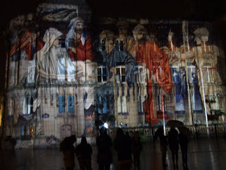
I haven't been inside Birmingham's Museum and Art Gallery to look at the art for a long time; but a display of images of some of the most popular works enlarged to epic sizes and projected onto the outside of the council house to a soundtrack of classical music was quite something to see. It was called 'Light Night' and was part of the annual ArtsFest – a weekend of free arts events.

I sampled comedy and poetry in a pub on Friday night and had an incredibly varied day on Sunday. Robin Bailey, the 'bard of Moseley', just about managed to make his great poems heard over the air conditioning in one of the rooms of the Art Gallery; the Notorious choir demonstrated how good the acoustics of the Industrial Gallery were for an acapella rendition of the Doctor Who theme tune, and KerrangFest on the Centenary Square stage left a ringing in my ears.

Council Tax in Birmingham is high, but subsidising events like this makes it sting a little less.