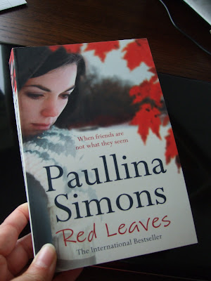
I belong to a reader's panel run by HarperCollins. They recently sent me a questionnaire about the author Paullina Simons and whether various cover designs and blurbs would entice me to look at her books. As I'd not heard of her, I had nothing to base the decision on but the pictures and words presented. Writers may not like it, but cover design is critical to the process of a reader deciding to buy or not to buy.
I've now received the one whose cover most appealed to me; but the style was similar across the titles: young, thoughtful woman with partly obscured face and suggestion of outdoor background. So it passed the first test of intriguing me enough to look further. Nothing to do with the story - I'm a fan of autumn leaves and my first impression of the woman wasn't off putting as it may have been were she more glamorous.
There are a few differences from the version I saw in the online survey. The author's name is plastered over this one in larger font than the title. It's put me off a bit. I don't know her, I don't know her work, it seems a bit presumptuous of the publisher to assume that it's her I care about. It's not. I want to know what that thoughtful woman's doing in among the leaves. I'm having a bit of climate confusion about the snow covered ground and autumn colour, but it's set in the US so I'll put it down to my unfamiliarity. The little teaser sentence was 'Some friends are not what they seem' in the version I 'chose'. A minor thing, but it had a slightly different tone. The lack lustre title and vague claim of 'International Bestseller' worry me. The picture worked for me; the words so far don't.
I'm prepared to give the book a go now it's here, but the huge name might have been enough to make me keep walking past the shelf in the shops. I'll let you know how I get on with the story. It's the bit which counts, after all.

4 comments:
My initial thought was, 'Ooh, that's nice,' then I had a closer look and got a bit critical.
Like you, I wondered about the snow/autumn leaves. The woman's shoulder is curiously hunched. And I've never seen 'Paulina' spelled with two 'l's.
But I imagine, in a bookshop, it's that first impression that really counts, the one that makes you pick up the book.
Yes, the picture would have made me pick it up and read the back or glance at the first page, so it clears the first hurdle.
Being the owner of a less common variant of a name myself, I don't mind Paullina. She's from Leningrad originally, so perhaps it's the more common version there?
K
This looks like a job for Superman! But...since he's not around, I'll take a stab at the US/North America thing. The only deciduous tree that I know of in NA to hold its (dead) leaves is a pin oak.
The leaves in the cover look nothing like pin oak. They vaguely resemble a maple or liquid amber (neither species holds its leaves long into winter. The abscission zones that form in autumn in deciduous trees (non-evergreens) generally allow the leaf to drop when sufficient force (wind/rain) is applied.
I would not pick up the book to check further. Unless this is set fantasy where maple leaves stay on through the first snowfall.
I'll let you know about the relative significance of red leaves and snow covered ground when I finish the book. For now, all I can think is that the artist thought how nicely the red leaves were offset by the white ground and took a liberty with nature.
K
Post a Comment